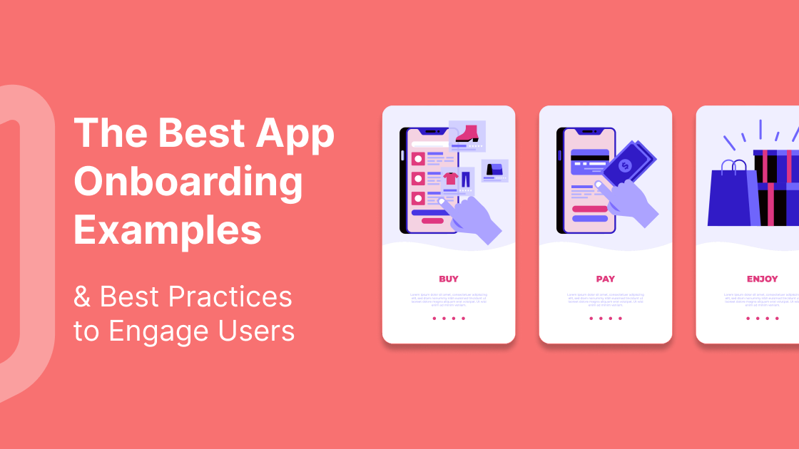
First impressions count, right? For mobile app onboarding, it’s no different.
Get it right? Happy customers will keep coming back, form new habits, and become long-term users.
Get it wrong? Expect low conversions, high churn, and a stressed-out product team.
Here’s the good news: we’re going to break down what mobile app onboarding is, share some of the best examples we’ve found, and share some guiding principles so you can deliver an app onboarding experience that drives long-term retention.
I’ll cover:
Mobile app onboarding: the basics
“The end goal of user onboarding is habit formation.”
- Ramli John, Content Director @ Appcues
Okay, let’s start at the beginning: what is app onboarding?
What is app onboarding?
Let’s start with the generally accepted definition.
App onboarding is the process of guiding users from the point of download or sign up to their first aha moment - the point where users realize your app’s value and how it will make their life better.
Do I agree with this definition? Not exactly.
Yes, guiding users along a frictionless journey to that pivotal moment of insight where they realize your product’s value is one of the most important activation events. But it’s just another step towards the goal, not the goal itself.
I’ve taken inspiration from Ramli John who hits the nail on the head with his definition:
“User onboarding is the process that takes people from on-the-fence evaluators to regular users of your product.”
People must become regular users, this is the key difference. And to become regular users, people must form a habit.
Arriving at the aha moment increases the likelihood they will become regular users, but it doesn’t guarantee it. That’s because experiencing something once, no matter how incredible the experience, is not enough to form a habit.
For habit-forming onboarding experiences, users need to experience the app’s value over and over again.
App onboarding = more than just an introduction
This leads to the next point: that app onboarding is not just about welcoming new users to your app and familiarizing them with the app’s value. It extends way beyond that through the customer lifecycle. Onboarding shouldn’t be limited to in-app experiences either. A successful flow should be:
-
Omnichannel - the best app onboarding experiences take the full user journey into account and involve cohesive messaging across multiple channels and touchpoints such as email, customer success outreach, self-service support, video walkthroughs, and more.
-
Multi-level - Primary onboarding involves introducing the user to the app and guiding them to their aha moment so they become activated. Secondary onboarding involves keeping users active and engaged, driving them to discover new features, and increasing their usage to drive revenue expansion. Where conversions are the key metric to focus on for primary onboarding, retention becomes the key metric for secondary.
App Onboarding Tip: When should you use in-app video tutorials vs. interactive walkthroughs/ tooltips in your app onboarding to help your users? Below are a couple of examples.
-
Want to show your users something outside your app, like how to connect an integration? Use video.
-
Want to show your users how to do something inside your app? Use interactive tooltips/ flows.
“Nobody has 5 minutes to watch a meta-video of you clicking through your product, and then trying to replicate the same actions themselves while going back-and-forth in the video.”
- Emilia Korczynska, Head of Marketing @ Userpilot
Is app onboarding necessary?
“System training, onboarding and instructional content are often just bandages trying to solve a bigger problem: poor design.”
- Alita Joyce, UX Researcher @ Google
Controversial? I don’t think so.
Here’s the key question you need to ask: is your app’s instructional onboarding useful?
Or another way of saying this: does your app’s instructional onboarding increase or impede usability?
As Scott Belsky, Chief Product Officer at Adobe explains, “in the first 15 seconds of every new experience, people are lazy, vain and selfish.”
This is especially true for mobile apps.
Why is app onboarding problematic?
According to Nielsen Norman Group - world leaders in research-based user experience - there are a few reasons the process of familiarizing users with a new app can be problematic:
-
Higher interaction cost. Interaction cost is the amount of attention and effort required by users to achieve their goals. Higher effort reduces usability.
-
Memory strain. The more onboarding asks users to remember things, the more it taxes their memory and distracts them from reaching their aha moment.
-
Does it improve user performance? The jury is still out on this. Simple mobile apps don’t generally need specific onboarding flows, lengthy explanations or video walkthroughs.
When does a mobile app need onboarding?
Of course, this isn’t true for every app. There are some occasions where onboarding flows are absolutely essential, such as:
-
Apps that need user information to get started e.g. banking apps.
-
Apps that rely on users’ specific preferences e.g. fitness apps that need weight and height.
-
Apps with unique or unfamiliar workflows.
For most mobile apps, users should be able to learn by doing. Why? Because it’s more effective to train people by showing them tips in context than presenting them with tutorials that explain the app’s UI.
This tactic is called progressive onboarding, where you instruct people to take actions - in the form of pop-up hints, tips and checklists - that are relevant to where they are in their unique journey through the app.
Function-oriented or benefit-oriented onboarding, on the other hand, is when users are shown screens as part of the flow which teaches them about the key functions or benefits of the app.

Rise is an alarm clock app that uses function-oriented onboarding slides. (Source: uxarchive.com)
For other mobile apps that require personal information upfront, the key here is to make sure it’s personalized and interactive.
Headspace is a great example of an app that understands how important personalization is. Instead of a boring sign-up form, they guide users through a series of questions to learn more about their customers.
This has two major benefits: first, it’s interactive and personalized, which keeps the customers engaged with a user-centric experience. And second, it means once the customer is activated, they can provide an ongoing personalized experience, reducing the risk of churn and increasing the likelihood of retaining the customer.

Questions help personalize an app onboarding flow and make it interactive. (Source: uxarchive.com)
Best app onboarding examples
In this section, I'm going to dig deeper into some of the best mobile onboarding flows. I’ve included onboarding experiences from across different industries - including fitness, SaaS, and education - to see if there are some common UX techniques these flows have.
1. Fastic
Fastic is a personalized, intermittent fasting and holistic health app. With 26 million members, it’s clear they’ve got their onboarding right.
The first thing you’ll notice about Fastic is its delightful UX which makes it feel easy and fun to enter your information. The copy is warm and friendly, and there are regular pauses between questions which do a couple of things:
-
They set expectations and remind people why they’re collecting all the information - to create a personalized fasting plan.
-
They allow Fastic to reinforce the benefits of intermittent fasting and acknowledge any potential roadblocks (e.g. data protection concerns).

Fastic reminds users of its value proposition throughout onboarding.
The next thing you’ll notice? The onboarding process is long! But with 26 million users, this clearly isn’t an issue (despite the fact a general “best practice” is to keep onboarding flows short). So how do they make it work?
-
They ask high-intent questions to understand what motivates people to use the app - helping them understand who is likely to continue and who is not.
-
They show progress through the onboarding process.
-
The questions and UX make it a highly interactive experience.

Fastic asks a lot of questions, making it a highly interactive and personalized experience.
The last step in Fastic’s onboarding process is the paywall. This is often a sticking point for many users where apps will see a spike in drop-offs. But Fastic provides a personalized paywall that shows the results they can expect, along with the time it will take them to achieve those results, all based on the information they have provided.

At the end of onboarding, customers arrive at a personalized paywall.
2. Blinkist
Another app with excellent UI and a light, pleasant feel is Blinkist. They’re an ed-tech subscription app that summarizes books and key ideas into 15-minute listens.
They lead with a slide that emphasizes the key USP of Blinkist while setting expectations that they want to ask a few questions to create a personalized experience.
 Blinkist sets expectations with its first onboarding screen.
The next phase of their onboarding checks off some important touchpoints to increase user motivation and increase their chance of forming a habit:
-
Blinkist understands the importance of setting up a habit so the first question they ask is all about goal setting. This is also a great way of collecting user intent.
-
They provide motivation by favorably comparing their reading/listening habits to others.
 High-intent users have a higher chance of converting.
Blinkist’s onboarding is not only interactive but highly personalized. Towards the end of the process, users are shown a variety of book recommendations and asked whether they like them or not.
The personalized experience, combined with many motivational prompts, works well to encourage potential customers to sign up for a free trial at the end of the onboarding. Like with Fastic, the paywall is personalized.

Personalized recommendations during onboarding create a better UX.
If you want to more about Blinkist’s app transformation that led to some impressive impact on business KPIs, please read our article Blinkist paywall transformation revolutionizes app user engagement.
3. Duolingo
Duolingo is the world’s most downloaded language learning app - probably just as famous these days for its TikTok channel as for its app!
Starting with a cute introduction of Duo, their mascot, Duolingo quickly gets into a learn-by-doing app experience by taking the user through an introductory exercise so they can determine their skill level. This is a great way of familiarizing them with the product’s core functionality.

Duolingo guides users quickly to their first aha moment.
In terms of the UX, Duolingo does an excellent job of gamifying the learning process in a few different ways:
-
The app celebrates every correct translation with audio effects, positive reinforcement, and great use of color psychology to help motivate learners.
-
Users are introduced to the concept of “Streaks” at the end of the test lesson. Continue practicing, and you’ll continue extending your streak. This is a great way to encourage habit formation.
-
“You’ve unlocked a gift!” - the learner is given a reward, again encouraging them to fulfill their learning goals so they can unlock more gifts.

By gamifying their approach, Duolingo makes it fun and interactive.
Duolingo continues with gamification post-onboarding too. The entire UI feels more like a mobile game than an education app, with levels and lots of widgets to explore. And if users want to skip ahead to a more advanced level, they can!
Duolingo’s app onboarding is an excellent example because they quickly guide people toward their activation (with skill level exercise) and then gamify the experience from there on to encourage habit formation - which is key to retention.
If you want to know more about Duolingo key metrics, please read our article EdTech and language-learning: 10 insights from Babbel & Duolingo.
4. Photoroom
Speaking of quickly guiding users toward activation…Photoroom is a design app with one of the most streamlined onboarding examples I’ve come across.
The core function of the app is to remove the background from any photos, great for e-commerce brands that want to showcase products or anyone who simply wants to remove the background from their photos.
While not every app can showcase exactly what it does so quickly and so simply, Photoroom takes full advantage of the fact that it can.
After just one question, the app immediately asks you to pick a photo, before automatically removing the background. Voila! That’s your aha moment right there.

Photoroom’s onboarding is short and quickly shows users its core functionality.
Photoroom tactfully shows their paywall after this demonstration which has a higher chance of converting given the fact users have just experienced first-hand the product’s value.

The paywall appears right after customers experience its core value proposition.
How to create an amazing app onboarding flow that drives engagement, activation and retention
“Ultimately, people should not lose sight of the goal of onboarding i.e. to set up the user for successful ACTIVATION and ongoing retention… the goal is not ‘onboarding completion’.”
- Andy Carvell, App Growth Strategist and Partner at Phiture
Now that I’ve analyzed some of the best-in-class app onboarding flows, let’s build on what I’ve learned to flesh out some guiding principles.
I'm not using the term “best practices” here because there is no one-size-fits-all approach. An onboarding and activation strategy that works well for a finance app will work terribly for a mobile game. Likewise, a fitness app that has a high onboarding completion rate would need to be completely rethought for a SaaS tool.
The point is this: let the data guide you, not your opinions!
1. Consistent messaging
A great in-app experience begins long before activation. As Andy Carvell, Partner at Phiture, explains:
“The golden rule is to build trust with the user by delivering a consistent message. Promise them what the app can do in your advertising and app store listing, re-state that value prop in the first screen of the app, then get them set up for either doing it in or right after onboarding.”
To build trust, the messaging across all these channels must be in sync.
2. Ask questions
There are so many benefits to providing an a frictionless onboarding flow:
-
It allows you to collect user intent which helps you predict whether or not they will convert.
-
It gives you an opportunity to personalize and individualize their experience - absolutely essential when it comes to app UX.
-
It lets you collect valuable customer data and insights that you can use for analytics or product iteration.
-
Answering questions is highly interactive and a great way to engage people.
If done right, it doesn’t matter how many questions you ask. A “frictionless” onboarding flow doesn’t mean short. As with Fastic, it’s clear that asking questions in the right way can lead to incredible results.
3. Drive users to activation
This is key. Your goal should be to get people to their aha moment aka the point where they have performed the core action in the app and have experienced first-hand the value the app provides.
How this is defined varies from app to app. For Duolingo, it’s correctly translating a word or phrase. For Amazon Prime, it’s receiving next-day delivery for the first time. For Uber, it’s seeing their driver arrive on time after tracking their ETA in real-time. Other apps have stricter definitions, requiring users to perform core actions several times before they are considered ‘activated’ (which correlates with higher retention rates).
The point is that without experiencing the product’s value first-hand as soon as possible, they are far more likely to churn.
Nobody wants that.
4. Make sure users see a paywall
This might sound counterintuitive, but it’s important to set expectations. As I often like to stress, freemium products don’t work because you’re trying to convince users with a subpar experience. That’s why we target 100% of app installs with a paywall during onboarding, even a soft paywall. You must set expectations very quickly.
If they are shown a paywall without expecting to see one, they’re more likely to churn. You can prevent this by ensuring your CTA buttons and messaging make it clear early on that there is a ‘free trial’ available, which signals that they’ll need to pay for it once the trial has finished.
I advise introducing a paywall toward the end of the onboarding process, not at the beginning. This gives you time to ask questions, set expectations, and make the user feel positive about their decision to download the app. It also means you can deliver a personalized paywall based on the answers you receive. Both Fastic and Blinkist do this exceptionally well.
5. Encourage habit formation
Remember, the end goal of user onboarding is habit formation. Experiencing an aha moment just once isn’t enough to form a habit. That’s why some apps have stricter definitions of ‘activation’: because a customer isn't truly activated until they’ve experienced the app’s core values multiple times, and reached the tipping point, which correlates with longer-term retention.
For Aaron Humphreys, Design Director and Co-founder of Intrface, Duolingo is one of the best examples of a habit-forming onboarding flow:
“They utilize progress tracking to help users complete daily tasks, gamify the onboarding process, use extrinsic and intrinsic motivators, and implement ‘learn by doing’. It’s one of the most obvious examples of a well-executed onboarding flow.”
Some of the best ways to encourage habit formation are:
-
Use intrinsic motivators - help users double down on personal goals
-
Use external motivators - encourage users to fulfill a goal for a reward
-
Gamify the UX and UI - a fun, interactive app environment will encourage the user to keep coming back
-
Remind of value proposition - keep reminding them what’s in it for them (e.g. Blinkist’s USP is all about ‘getting more knowledge in 15 minutes which they continually remind users about during onboarding)
6. Iterate, iterate, iterate.
This point is so important. To understand if your app is successful, you need to gather data. Without it, you simply won’t know why users are churning, where they are churning, and which areas to focus on optimizing.
One thing to note here: optimizing purely for onboarding completion rate is a red herring. As Andy Carvell explains:
“Keep in mind the broader goal of activation and measure any onboarding iterations not just on whether more people complete all the steps, but whether this uplift translates into higher activation.”
If onboarding completion isn’t translating into activation, then you should be testing fundamentally different onboarding experiences. Only once you have data that shows your onboarding flow is working should you turn to micro-optimizing the various stages of that flow.
Funnel analysis will be key here so you can see exactly where users are dropping off. I also recommend reaching out to customers directly to identify pain points and areas of friction.
There are lots of effective ways to collect feedback:
Test, learn, iterate. That’s the virtuous cycle of product development.
If you’re looking to improve your in-house testing capabilities, Purchasely has a no-code a/b testing solution for subscription apps. Whether you’re a marketer or product manager, you can design and run UI and price tests in just a matter of seconds through on a simple set-up screen. You’ll also get access to full-funnel analytics with our platform so you can maximize app user engagement across all touchpoints.
App onboarding tip: Pttrns is an archive of design patterns and flows from some of the biggest product startups. You can access commonly used UI components to see complete journeys such as onboarding flows for apps like Duolingo, Headspace, and Uber. There’s also UXArchive, another library of mobile user flows. Both are worth checking out for ideas and inspiration!
Key takeaways
“Upgrade your user, not your product. Don’t build better cameras - build better photographers.”
- Kathy Sierra, Author of Badass: Making Users Awesome
-
App onboarding isn’t just about welcoming new customers to your product. The end goal is to encourage people to form a habit so they become regular users of your product.
-
App onboarding is difficult to get right. The latest data on this shows that the average retention rate for iOS and Android apps after day 1 is 24.3%, dropping to 3.4% after 30 days. In other words, after 30 days, you can expect 97% of your users to have stopped using your app.
-
Poor design, high interaction cost, and memory strain are some of the main reasons why onboarding flows can impede rather than increase usability.
-
Apps like Fastic, Blinkist, and Duolingo are some of the best examples of mobile onboarding flows I’ve seen.
-
The key elements of their onboarding flows include: asking lots of questions; a well-designed and highly interactive UI; personalized prompts, recommendations, and paywalls.
-
Another key onboarding step (where this is possible) is driving customers towards their “aha” moment i.e. the point where they have performed the app’s core action and experienced the value it can provide.
-
Always be led by the data, and always be testing and iterating your onboarding flows as and post-onboarding UX.
Ready to personalize your subscription flow?
Purchasely is also proud to make many resources available about onboarding.
Articles about app onboarding
Podcasts about app onboarding
Having a personalized onboarding flow is a key pillar for any effective subscription strategy. Book a 30-minute Purchasely demo and see how you can create a smooth, frictionless onboarding experience that drives activation, retention and revenue.