Visually captivating paywall design is decorated with aesthetically appealing elements. But great paywall design blends this catch with user experience, usability, and functionality.
Purchasely team of UX, UI, and growth experts has researched various subscription apps across verticals and noticed the paywall design patterns and elements used by the most forward-thinking subscription apps.

This article, 'Tip #1. Know Your Users' features a section from the eBook 'Top 10 Paywall Design Tips: Lessons from winning subscription apps' that shares practical recommendations with matching examples to help readers design paywalls that convert users.
Take a read at another featured section from the eBook, 'Tip #3. Do more than meets the eye' to learn about how paywall imageries can either make or break app users' paywall experience.
Tip #1. Know Your Users
Rationale
Project paywall design! Let’s open a design tool and start sketching - avoid
this urge but keep the dedication.
If you have been in the In-App Subscription business as well as done and
seen a multitude of paywall designs, you can easily be tempted to go straight into mocking up what you think will work.
But you are not your user. Designing a paywall that converts users starts with a good understanding of not only who your users are but also what their in-app behavior and motivations are.
Designing a paywall without consumer insight is like jumping off the deep end
without knowing how to swim.
Only when you have the right set of user knowledge can you attempt to design a paywall experience that can hit the bullseye.
Solution
When equipped with the right tools, you can pre-define, capture, and intelligently visualize rich data about your users effortlessly.
Taken a step further, with deep user knowledge, you can improve acquisition,
conversion, and retention by making the following improvements.
Revealing areas to expand and improve your value proposition
You can discover user interests you haven't considered so far and attempt to
tailor your app's marketing effort and the value proposition to reach a swatch of potential customers that have been flying under the radar.
For example, a self-fitness app might focus on people who usually work out
alone at home using simple to no equipment. When looking at app onboarding
survey data, the app might see that many users like to work out at a gym.
Based on this information, the app could optimize its paywall design with images and messages that gym-goers can resonate with.
The app can also revamp its value proposition with additional workout content involving gym equipment.
Improving design and business focus
Having your hands on the user knowledge enables you to establish a consistent brand identity and focus on offering particular products, services, and subscription plans that answer your users' needs.
When you can identify what your users are looking for and what satisfies them, you can attempt to clear the clutter of effort put on products and services that bring less business impact and keep the business practices laser-sharp focused on delivering value to your customers that aligns with their needs.
Followings are some of the many areas of user insight you can research to start the paywall design process off on the right foot.
Demographics
Demographic information, such as sex, age, gender, nationality, or income, is
relatively easier and cheaper to access.
You can attempt to collect the information that is relevant to your app's value
proposition during the signup and onboarding process. Sometimes, your
product already defines for itself what qualities your users fit into.
For example, if you are running a "period and fertility tracker" app, you'd already know your target audience is women in their 20s to 40s.
Whether for a single user or a segment of users, you can try to adapt your paywall design to what works best for different demographics.
For example, it'd be a good idea to use green for users based in Muslim countries. Also, a clean UI with less visual clutter can work well for young children, and graphical content over textual content can work well for teens (source: WebFX).
Behavioral Pattern
You can learn about your users based on their behavioral patterns, such as the time spent on a specific screen, In-App Purchase and subscription habits, or frequently selected content.
For example, if a news app's track record shows that most of its users interacted more with articles hosting videos than with purely textual content, adding moving imagery, such as GIFs or videos, to the paywall could improve the paywall performance.
You can also tailor the design based on your users' app usage rate.
For example, for light or new users who may benefit from learning about the app's value and products, you can use display structures like "Carousel (available in Purchasely paywall builder)" to deliver a large amount of information without overloading the screen.
Speaking of which, if user insight hints that people enjoy swiping through a
carousel, it could be a good reason to leverage the structure more often.
A common misconception about paywall design is that it’s a work focused on a single-point engagement. Ideally, subscription apps should display paywalls at every possible vital in-app touchpoint such as app onboarding, app launch, home page, and settings. By doing so, apps can extend the business potential of paywalls from one siloed screen to the entire subscription experience.
In order to identify the right locations to provide an all-encompassing paywall
experience, you can track more specific behavioral events like “LINK_OPENED”, “PLAN_SELECTED”, “SUBSCRIPTION_STARTED”, as well as specific subscription events such as activation, plan change, renewal, cancellation, and pause. Having a view of these events in a chronological order showing where each user has landed and headed towards along their journey, can help you optimize and contextualize your paywalls to be
displayed at different touchpoints.
.png?width=698&name=inappevent%201%20(1).png) Purchasely solution allows apps to track every important in-app event and
Purchasely solution allows apps to track every important in-app event and
visualize them in chronological order.
Location
By knowing which country, state, and neighborhood your users are based in,
you can tailor your paywall design and messaging according to location-specific preferences based on climate, shared interests, events, language, norms, and politics.
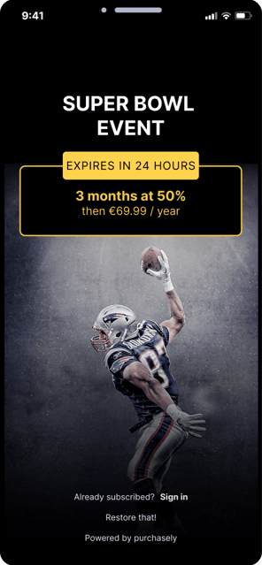
 For example, the National Football League championship(NFL), Super Bowl is one of the most significant national events in the US. When the second Sunday in February comes around every year, apps can try to deploy a paywall customized with the event’s theme for US-based users.
Here's another example. Suppose you are running a shopping app for clothes. In that case, you can use images, colors, and messages that convey warmer
clothing to target users in cold climates and show the opposite to those in warmer climates.
You can imagine displaying bikini photos to users in Montreal, Canada in January would be downright out of context. The same month in Sydney, Australia, on the other hand, would be precisely the right time to show bikini photos.


.png?width=698&name=inappevent%201%20(1).png)
 For example, the National Football League championship(NFL), Super Bowl is one of the most significant national events in the US. When the second Sunday in February comes around every year, apps can try to deploy a paywall customized with the event’s theme for US-based users.


