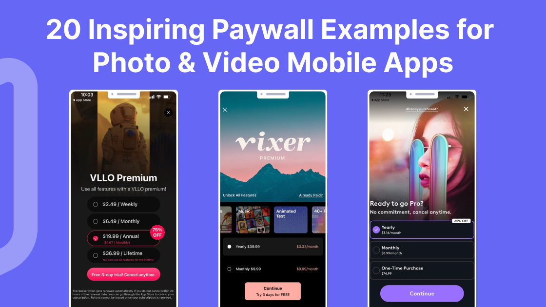
Looking for some paywall inspiration from photo and video apps? We've got you covered. Steal these 20 great paywall examples and test them out for yourself.
Remember when Instagram was the only photo app you had on your phone?
How times have changed. Today, there's an abundance of photo and video apps, each offering its own unique features and capabilities. And with the rise of the subscription economy, more paywalls too.
Our team have done the research for you and compiled 20 great paywall examples from photo and video apps. We’ll cover:
-
What is a paywall screen?
-
Why do app companies use paywall screens?
-
Photo apps: great paywall examples
-
Video apps: great paywall examples
-
Photo & video apps: great paywall examples
Buckle up and get ready to be inspired.
What is a paywall screen?
Before diving into the paywall examples for photo and video apps, let’s take a moment to remind ourselves what a paywall is and why they’re important.
A paywall screen is a feature in mobile apps or websites that restricts access to premium content or services until the user pays a fee. The paywall acts as a barrier, requiring payment before allowing users to view or access certain content. This is a common monetization strategy used by businesses across all types of industries to generate revenue from their digital products. Some examples include:
To learn about the different types of paywalls and how you can use them to increase user engagement, acquisition, retention, and revenue, check out our guide What is a Paywall? Different Types of Paywalls Explained.
Why do app companies use paywall screens?
App companies and other businesses use paywalls to gain subscribers, monetize their digital products or content, and ultimately generate revenue. For many companies, paywalls provide an alternative way to advertising-driven business models (although it’s worth noting that many app companies, particularly, monetize their audiences with hybrid strategies that combine paywalls with in-app advertising).
In many ways, a paywall screen is an extension of your app's user experience. To ensure a steady stream of new subscribers, it should be continually tested, iterated and dialed in over time to match user feedback and preferences. By creating an engaging, attractive and transparent paywall, you can ensure a better user experience, resulting in more conversions.
To learn more about paywall A/B testing, check out this helpful 50-second read.
Photo Apps: Great Paywall Examples
Let’s start with our pick of great paywall examples from photo apps.
Dream by WOMBO - AI Art ToolMojo
The Dream by WOMBO app uses a range of components to construct an effective paywall. Dark colors paired with a background image demonstrating the app's capabilities, as well as some of the app’s key features, all work together to maximize conversion rates.
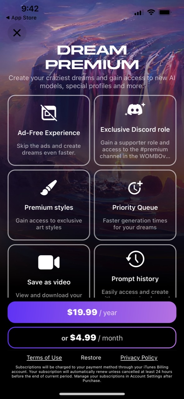
Photo Collage
The Photo Collage app stands out for a few reasons: it’s got a clean, minimalist design with some bright colors that work well as a contrast. But the biggest conversion trigger is its use of numbers. Users like numbers! It’s a great way to show exactly how many filters, stickers, frames and other key features an app has.

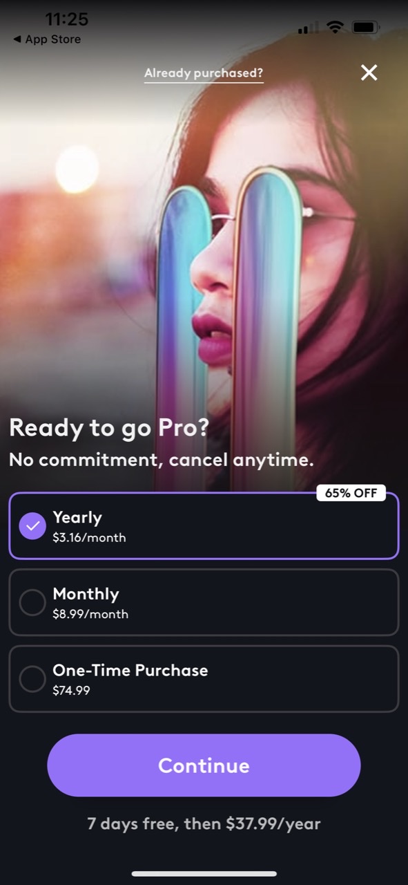
Photoleap by Lightricks
The Photoleap app uses similar hues to Dream by WOMBO and provides a striking background image. But the standout feature here is the highlighted discount of ‘65% off’ on the yearly option, used to incentivize users to sign up for an annual subscription. Additionally, their call-to-action (CTA) button features low-commitment copy (‘Continue’) to invite users to take the next step.
Beauty Editor Plus Face Makeup
The Beauty Editor features a prominent paywall with a white background, and a photo of a smiling woman to show off its makeup editing capabilities. Clear, straightforward language is used to emphasize the key features, and the brightly-colored purple button stands out to offer a 7-day free trial. All in all, the paywall is designed to draw attention to the product and highlight its capabilities.

Tezza
Tezza’s paywall hooks users with a stunning photo of the New York skyline with a vintage preset. The photo takes up approximately 80% of the paywall, so as with some of the above examples, they clearly want their app to do the talking. The headline is short, direct and catchy (Live. Create. Repeat.), whereas elsewhere copy places emphasis on the free trial and the fact that users can cancel anytime.

Phonty
Phonty is an advanced photo editing app for non-designers that takes a different route from the above examples. How? Phonty puts a feature comparison table front and center of its paywall to show what potential users will get on a free plan vs a premium subscription. A couple of other features worth noting on this paywall: they’ve crossed out the monthly subscription price to highlight the annual subscription; the CTA button uses a personal pronoun ('Start my free trial') instead of ‘your’ which is a common copywriting technique.

Prisma
Social proof is a powerful tool in marketing, as the opinions and behaviors of others have a considerable influence on our own decisions and behaviors. Prisma let their 120+ million users do the talking for their paywall, with their headline at the center and standing out against a dark background. They provide the source, too, which isn’t something you always see, adding credibility to their claim.

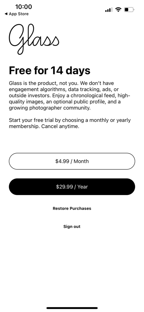
Glass
Glass isn’t a photo editing app: it’s a photo-sharing platform and photography community. But its paywall is worth seeing. They’ve thought outside the box and kept it entirely text-based. No bright colors, no photos. Just a simple, black-and-white app paywall that looks and reads more like a letter.
Video Apps: Great Paywall Examples
Next up: video apps. Below are some great paywall examples that stood out for our team.
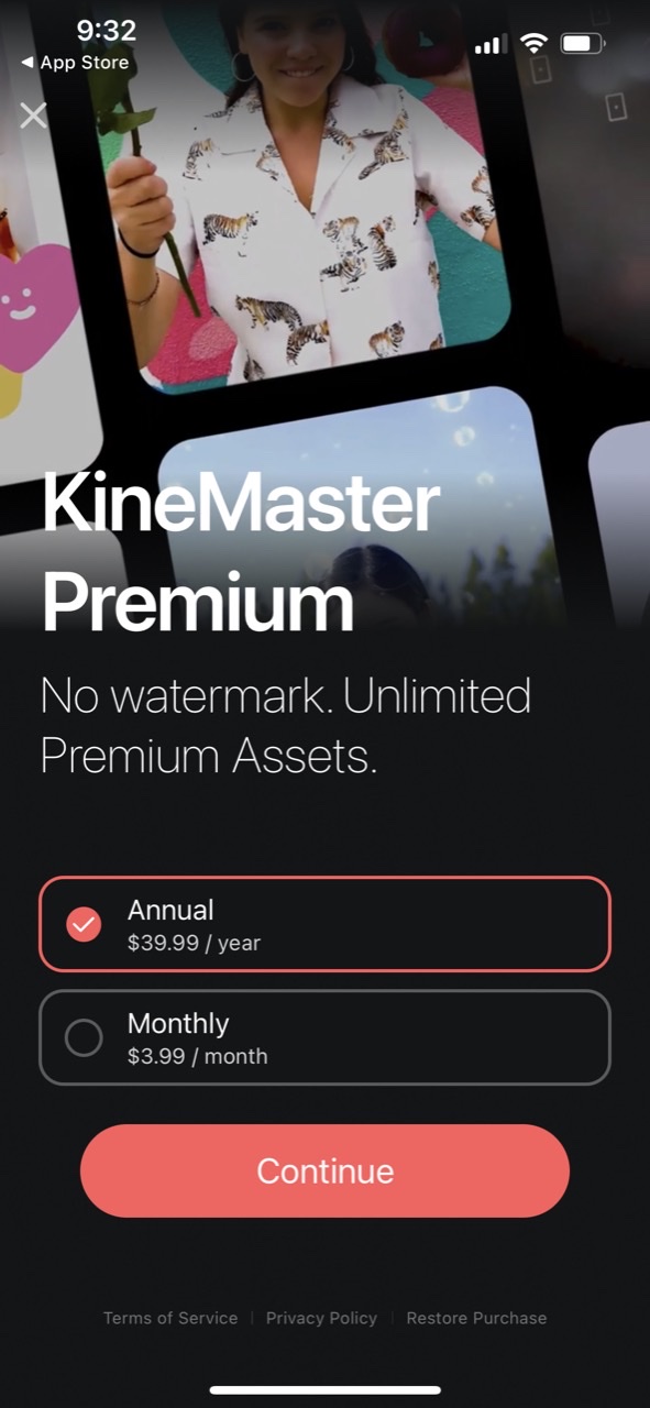
KineMaster
The KineMaster paywall keeps it simple by highlighting two of its core features along with its with two available pricing options. A bright red CTA button set against a dark background helps the CTA button stand out.
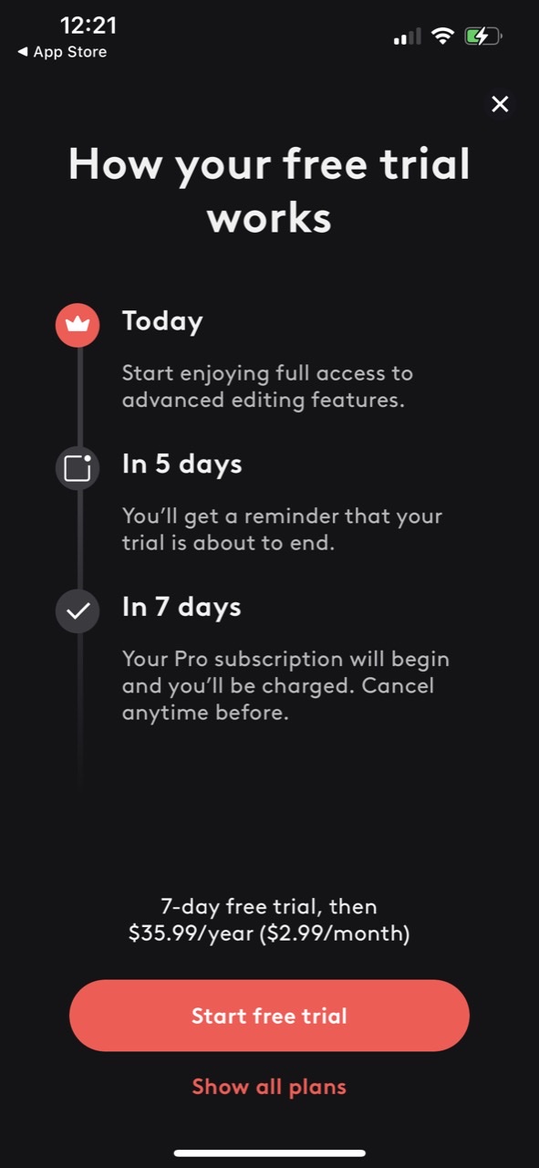
Videoleap by Lightricks
The Videoleap app uses its paywall to show users exactly how their free trial will work in 3-steps. By setting expectations and being transparent, this technique is likely to persuade more users to sign up. It’s a great conversion tactic.
This type of transparent approach has been deeply analyzed by the Purchasely team in this article : Blinkist paywall transformation revolutionizes app user engagement.
You may also listen our exclusive podcast episod this type of paywall invented by the product team of Blinkist: Using transparency to increase your conversion rate with Eveline Moczko (Blinkist)
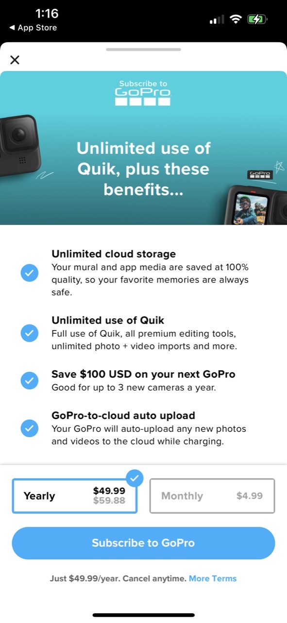
Quick by GoPro
App users enjoy learning the perks they'll gain from using an app. Quik by GoPro leverages this by showcasing some of their top advantages with the goal of converting potential users into paying customers.
VLLO
VLLO uses a discount badge to highlight the huge savings potential users can make by opting for the annual subscription (75% off). The strategic use of brand colors for the badge and CTA is an effective UX design tip to guide users toward converting.

YouTube Premium
Well-known brands like YouTube make their own rules. YouTube leans into its strong brand credibility by placing its logo front and center with a short subheader below that pitches its core benefit: ad-free and offline videos. Whereas other brands tend to make their pricing options a key part of their paywalls, YouTube instead opts to make its bright blue CTA with the copy ‘Try It Free’ the focus.

Photo & Video Apps: Great Paywall Examples
All of the apps below work as both photo and video editors. You’ll see some of the paywall design tips used above, as well as some new and unique approaches to paywall design.
Canva
Canva is one of the world’s most valuable startups, and they get a lot of things right about their paywall. They include a bulleted list of benefits which works because…users love lists! It’s a simple and effective way of improving readability. The little red badge highlights the discount on the annual subscription which, as mentioned earlier, is a great conversion booster.

Lift: Story Maker
Lift, an Instagram Reels editor for iOS, adds a fun and interactive element to its onboarding by asking users to take a quiz. The reward? A personalized app paywall, which is a highly effective conversion tactic - we recommend them!
Prequel
Like Canva, the Prequel app has a bulleted list of benefits that users get on a premium plan. But what stands out on their paywall is how they target users still on the fence. First, with a simple, direct question: Not sure yet? And second, with an interactive option where users can tap to enable their free trial. It’s a unique way of grabbing the attention of potential customers.

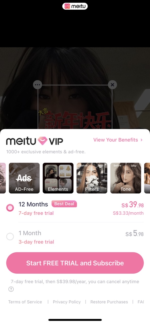
Meitu
Meitu uses a carousel of images to convey its subscription experience. Smartphone users are used to swiping and scrolling through images, so it’s a great way to meet them on their terms in a format they’re familiar with.
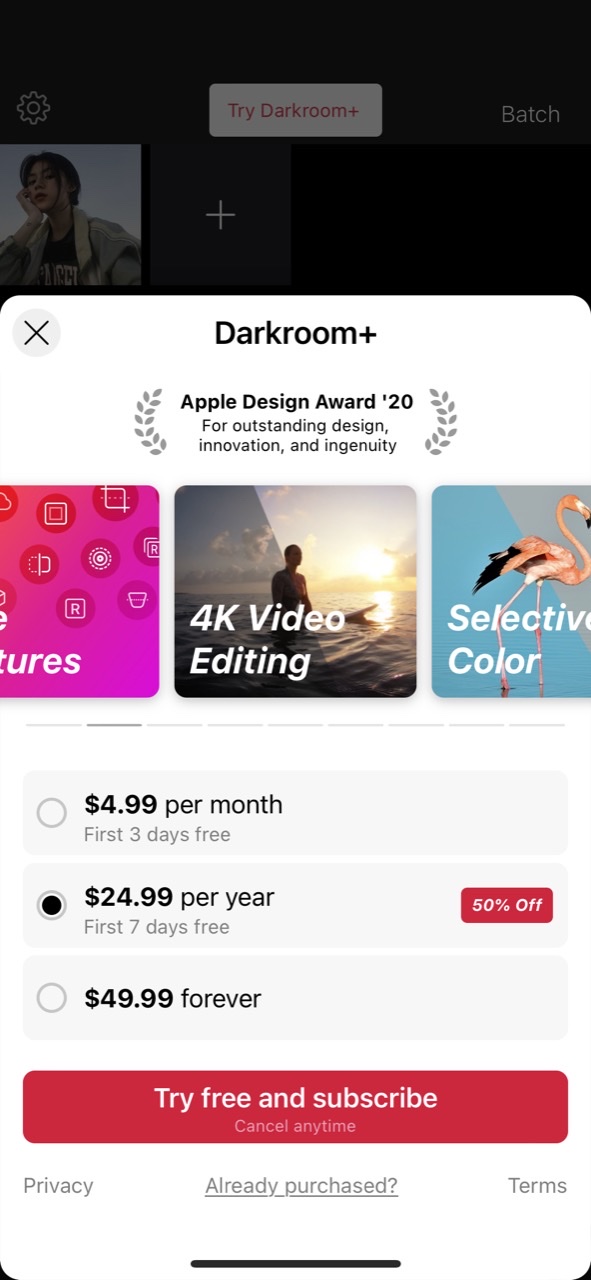
Darkroom
Social proof comes in many forms: user reviews, user-generated content (UGC), or the number of times an app has been downloaded from an app store. In Darkroom’s case, they’ve chosen to display their award-winning credentials. It’s an effective way to build trust among new users, highlighting the app’s credibility and quality.
Bazaart
Confidence is key, and nothing speaks of it more than Bazaart's paywall. Giving users too many choices can hurt conversion rates and Bazaart’s paywall design reflects this understanding. It looks and feels confident, provides an easy user experience, and increases the likelihood of potential customers signing up for the free trial.
Vixer
Vixer's sleek paywall is the perfect combination of all the elements that make a paywall successful. With a stunning background, a carousel of app benefits, two pricing options, and a bold CTA button set against a contrasting black background for maximum visibility. And they’ve packed even more punch into their CTA by placing the copy "Try 3 days for FREE" right inside the button, making it impossible to miss.

Key takeaways
-
Photo and video apps have a unique advantage over some other apps in that they can show what their product does as part of their paywall experience.
-
Designing a paywall doesn’t have to be complicated. Other best practices include listing benefits, including social proof and using quizzes to personalize the user experience.
Unlock your app’s potential with Purchasely’s no-code paywall builder
Purchasely is an app monetization platform designed to drive revenue with one-time purchases and In-App Subscriptions.
If you need help carrying out paywall A/B tests, Purchasely has a no-code paywall builder that lets you run A/B tests in seconds and is easy to set up.
Or you can see it in action for yourself by booking a demo.
For more paywall inspiration, check out