This post is brought to you by Yodel Mobile, the leading global app marketing consultancy named ASO Agency of the Year 2021. It is part of 'Top 10 apps that are killing the subscription app game': a series co-produced by Yodel Mobile and Purchasely.
Continue to 'Top 5 apps that are winning at the paywall design', the second part of the series written by Purchasely, for winning paywall design examples.
Subscription apps have become the next big thing in the app space significantly and the value of In-App Subscription spending in the US is predicted to rise to over 900 million USD by the end of 2026. There’s no surprise then that many app owners choose this app monetisation model over the others, meaning that its popularity makes the competition fiercer and the path to success harder.
There are many components to making the subscription model work but the rule of thumb is convincing your users that your app is the product they need. The sooner they understand its value, the better your conversion rate is going to be and the higher the revenue your app is going to generate. If you think that creating an amazing product is enough to convince users to part with their cash, you’re not wrong but also not entirely right. Your spoilt-for-choice users won’t stick around if your product is not up to scratch, but there are more elements you need to consider for your subscription app to generate revenue.
We took a closer look at 5 subscription apps that are killing the conversion game at the moment to analyse their methods and strategies that drive the results you may be hoping for. We delved into their App Store Optimisation, paywall strategy, onboarding, communication, and free trial approach to better understand what makes their conversion a success.
Here's what we've learned.
Connecting with users through benefits onboarding
1. Paired - a guide to improved communication for couples
It’s hard to speak about tactics aimed at increasing the in-app conversion rate without mentioning the onboarding process. A good onboarding journey not only helps to kick-start your relationship with your users but also educates them on the app’s key functionalities and facilitates a positive user experience.
Paired’s onboarding is a great example that shows how you can use onboarding screens to present the app’s benefits in a clear, engaging, and impactful way. After all, no one wants to read a piece of text to understand what the benefits of your app are especially as you only have a short window for education before the user may completely switch off.
Ending the process with the questionnaire screen helps to create a personalised user experience and adjust the app’s content to the user’s needs. The order of the onboarding screens matters too. Only after the onboarding process are the pricing screens introduced, which helps the user to learn the value of the app first and justify the cost of a paid subscription version.

Now, let’s move on to the upsell strategy. Using a free trial to hook your potential users is a common strategy, but the Paired app offers it only for an annual subscription plan, hoping to secure that user for longer. Bonus? Your partner gets a premium subscription for free (since the app is meant to be used as a pair), helping to break down the subscription cost in half.
Since emotion is what drives purchasing behaviour, offering instant gratification is a great conversion tactic helping to build a strong bond with the user from the get-go. Additionally, Paired clearly and transparently communicates the free trial experience with the user to ensure they actively opt-in for a paid subscription. This clear comms strategy prepares the user for their free trial experience and ensures to keep user sentiment high.

App Store Optimisation for the win
2. Canva - photo & video editor
You may wonder what App Store Optimisation has to do with conversion. Well, more than you think! Your App Store listing is the first point your users interact with your product, so making an excellent first impression is essential. If your Product Page doesn’t give an overview of your app’s value proposition and your app’s rating is low, your conversion rate will suffer.
So what does the Canva app do well?
Firstly, there’s no doubt what the app’s functionalities are once the user lands on the product page. Everything from the app subtitle through screenshots to meta descriptions indicates it’s a photo, video, and logo editor app, providing users with a brief overview of the app’s capabilities.

The Canva app cleverly takes advantage of some of the new App Store features. For example, by utilising a video in their in-app event card, Canva can give users a taste of what they can expect inside the app. The premium features of the app are clearly outlined in Canva’s promotional in-app purchases card, making the most of all the creative asset opportunities inside the app store listing, engaging the user and enticing them to download.

It’s worth adding that a 4.8-star rating also has a positive impact on the app’s conversion rate. Canva’s app developers take time to respond to each review in a personal and non-automated way, making sure that every app issue is addressed and resolved. In our books, it’s a 5-star approach!

A seamless in-app experience: from sign-up to completing an in-app action
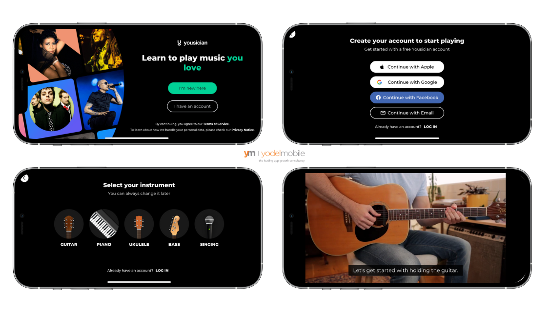
3. Yousician - instrument teaching app
Completing your first lesson has never been easier! Yousician gets you into that practice mode from the start cutting the onboarding short and letting you jump into the first lesson as soon as you sign up. No fuss, no confusing navigation, just simply, ‘here’s what we offer’. This approach allows the users to quickly engage with the app, immediately see its benefits and encourage them to explore more. There are 4 free lessons to help you get started, which is just enough to see the app’s value and help to get users hooked.
What is more, the app allows you to view its interface only in a landscape orientation (horizontal), which is an unusual and rare approach but makes a lot of sense considering the app’s functionality. This enables users to maximise the screen view while watching the videos, skip the necessity to lock their phone orientation, so it doesn’t disrupt the experience by flipping to portrait mode, and make it easy to prop up the phone and scroll through the lessons while holding the instrument one is learning to play.
Free trial with an offer
4. Uptime - the world’s best books summarised to 5 min stories
Whilst a free trial is not essential, it can be extremely impactful in encouraging more users to download your app as well as convincing them to pay for it. It is particularly important if your app has a lot of existing competition.
Uptime app offers a free trial giving users full access to their content for a limited time. However, what makes this approach extremely effective is the incentive. A 75% discount is an enticing offer, which not only makes it compelling for the user to subscribe but also helps the brand to create a favourable brand image. Who doesn’t love a good deal, after all?
By using words such as ‘today’ Uptime exclusively informs users about early lifecycle deals and creates a sense of urgency. This three-day free trial is combined with an intense CRM journey, encouraging engagement over this initial period to build relationships with the users and help them to take advantage of the full capabilities of the premium plan.

Staying in touch with the users through communication channels
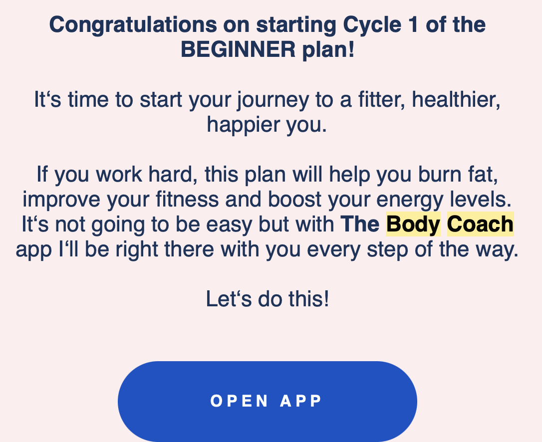
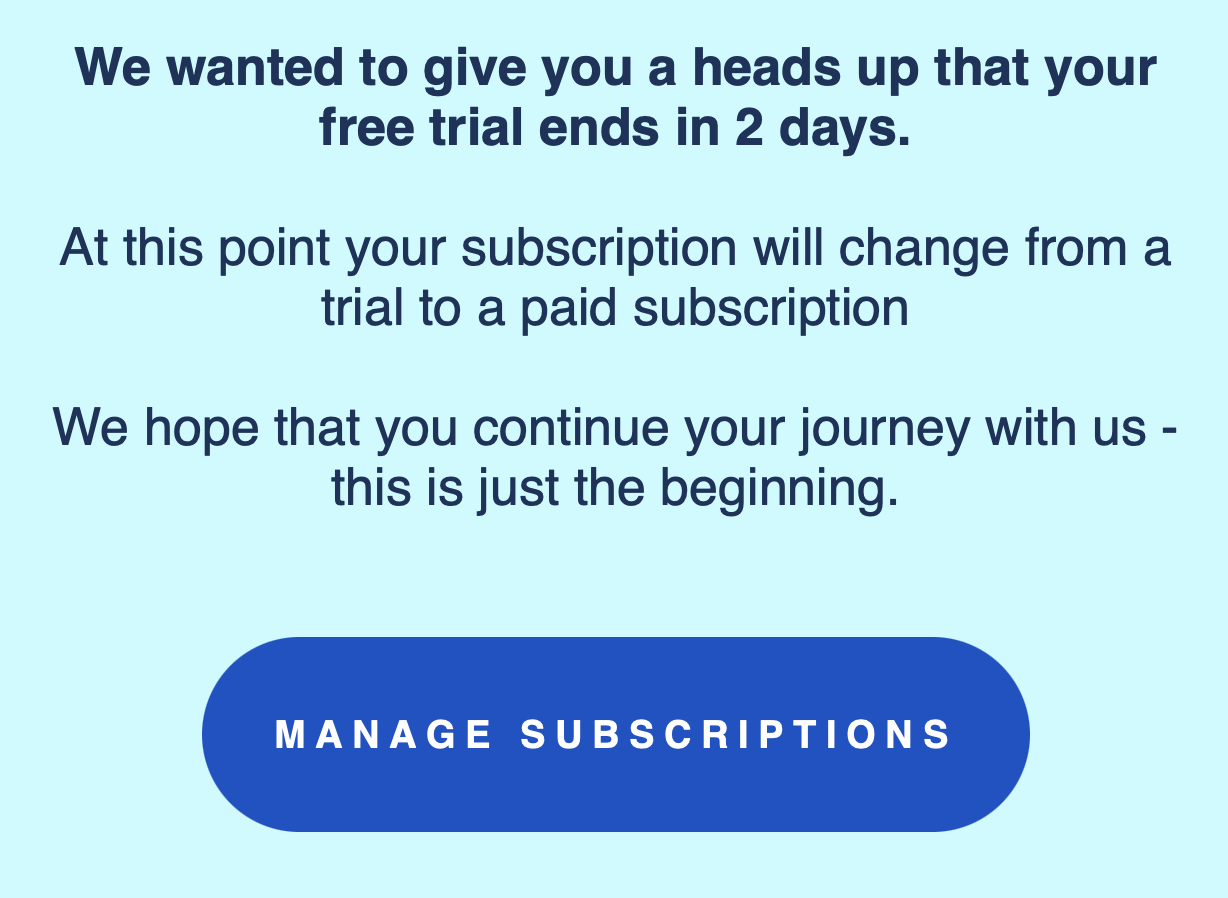
5. The Body Coach - nutrition and training app
Sending targeted email campaigns can guide your users through the app journey, build a strong relationship with them and boost their odds of subscribing to your app.
Some may say that a legacy channel like email is a pointless tool in the fast and ever-changing app ecosystem. However, email is irreplaceable for certain types of messaging and is still widely used in-app marketing.
The Body Coach app is the perfect example of how you can engage with new audiences, tell a story, and convert through email strategy. Within the 7-day free trial, the user receives 3 emails - each aimed at pushing users through each lifecycle.
Email 1 - free-trial activation:
As with every workout plan, the hardest part is to start. The Body Coach app messaging not only builds excitement about the journey to a new, healthier self but also promises to be with them every step of the way. These emotional triggers help to create a strong relationship with the users and keep engagement at a high rate.
Email 2 - 2 days left on your free trial
An informational email has its benefits too. Firstly, you remind the users they downloaded your app, which can prompt them to activate it. Secondly, by adding a level of transparency in an early stage of the trial experience, you give users the choice of whether or not to stick to their premium plan without a hard sell.
Email 3 - Cancelling a free trial
Did your users drop off? Why don’t you ask for their feedback to understand why? This approach not only helps The Body Coach to build a better product but also shows that they care about their users and their opinions. It’s a great way to build a positive image of the brand and increase brand loyalty.

Remember, increasing the app conversion rate does not have to be a challenge if you ensure all elements of your user lifecycle are optimised for success. Looking to maximize conversion and grow your app? Book a free app growth consultation with Yodel Mobile experts HERE.
Top 5 apps that are winning at the paywall design
When we talk about apps that are killing the subscription app game, we really mean their design. The quality of subscriber experience, which directly impacts the revenue of mobile apps, shows the difference between good and poor paywall design. Follow this link to read 'Top 5 apps that are winning at the paywall design', part of the series written by Purchasely, for winning paywall design examples.