Creating a high-converting app landing page should be one of the pillars of your mobile app marketing strategy. Learn about what an app landing page is, key elements to include, and some examples in our guide to the best app landing pages for subscription apps.
Landing pages aren’t new. Speak to any marketer in any industry and chances are they’ll tell you why landing pages are an important touchpoint in their overall marketing strategy.
But what about mobile apps…do they need landing pages too?
Given you’re trying to get users to download an app, it may seem strange to invest time and resources into building a web page to promote your app. But app landing pages can be powerful tools that drive higher conversions and more downloads. They allow you to drive organic traffic to your page, set up targeted campaigns, and give you more space (compared to the app store) to educate potential users on your app features and benefits. It also gives you another distribution channel - which is important in today’s digital economy where the customer journey is as fragmented as ever.
Check out this guide to find out everything you need to know about creating a high-converting landing page for subscription apps. We’ve even included some examples and will give you our take on what makes them work.
What is an app landing page?
An app landing page is a standalone web page created to promote your mobile app. They’re used to drive organic traffic on Google via branded search terms, or they can be used to drive targeted paid campaigns via Google or Facebook to promote your app to new audiences.
The main difference between a landing page and your homepage is that landing pages are designed with specific goals or call-to-actions in mind. For mobile apps, the CTA is typically to download the app. With other products or services, it may be to download a report, sign up to an email list, book a demo, or activate a free trial.
Simply put, landing pages are the most effective way to promote your app and increase downloads. You can drive paid and organic traffic to your page, depending on your strategy (more on this below). And the singular focus – instead of the many “distractions” of a web page – increases the likelihood that a prospect will take the desired action.
What should an app landing page include?
So you want to create a high-converting mobile app landing page?
There are certain elements that every landing page should have to maximize its chances of converting prospects. Consider these your landing page best practices. I’ve included seven of the most important conversion elements below. Let’s take a look…
Headline
This will be the first thing your visitor will see on the page. It needs to explain what your app does and the benefit of using it in a concise and clear manner. A great way to test your headline message is to check if it passes the ‘caveman test’. The idea is: could a caveman look at your landing page and understand in 5 seconds what you offer? If your headline fails the test, you’ve still got work to do.
Subheadline
The goal of the headline is to get them to read the next sentence. On a landing page, that means your subheadline. Your subheadline is just as important by elaborating on your headline and giving the reader more specific details about how your app works.
Features/benefits
Features describe what your app does. Benefits answer the question: what will I get out of using your app? It describes the outcome users will experience. Benefits are an important part of your messaging strategy because the copy is focused on the customer - which is essential. That’s not to say there isn’t a place for writing about app features on your landing page. Simply that benefits are more important, and so should be visible higher up on your landing page.
Social proof
Visitors have read the headline, subheadline, and all about the benefits and features of the app. Great - but where’s the proof that it works? User reviews and customer testimonials are an essential part of the user journey - about 95% of customers read reviews before making a purchase. Awards and app recognitions can also be used as powerful and persuasive forms of social proof that could nudge the user towards downloading the app.
High-quality visuals
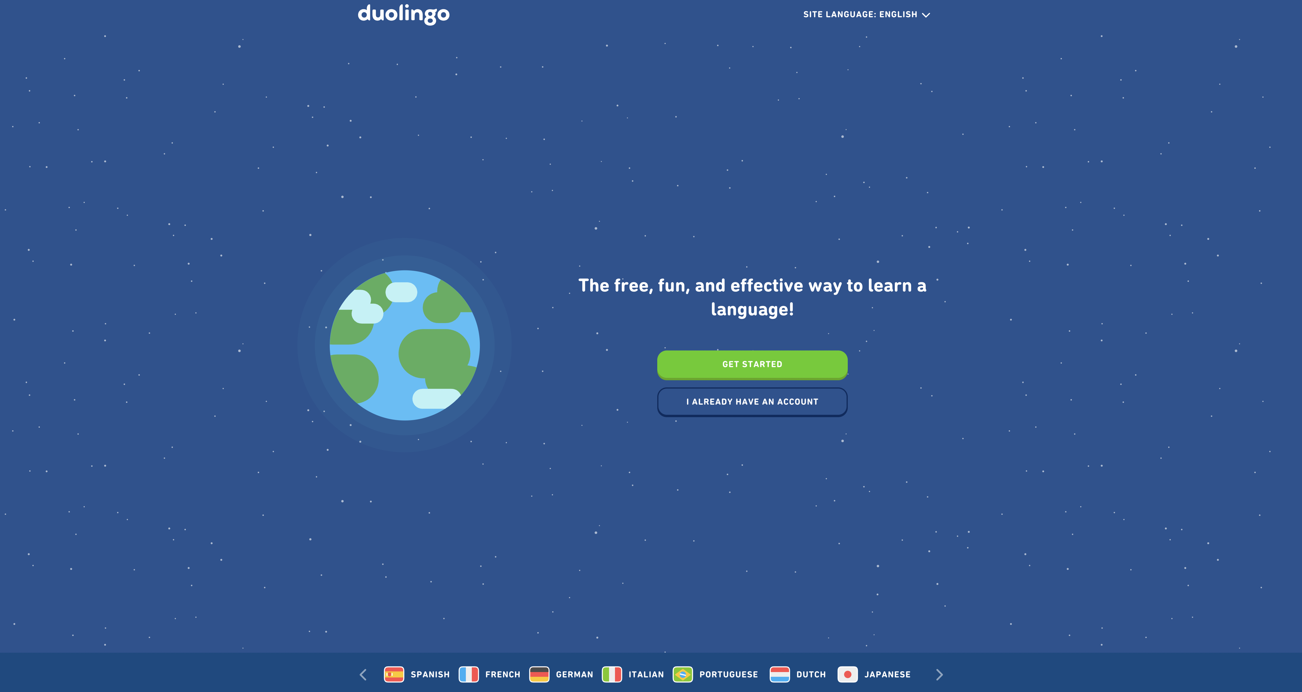
The type of visuals you choose to use depends on the app, the audience, and how well-known your app is. For example, Duolingo is a great example that relies on its famous green owl mascot and cute animated style as part of its landing page visual design. Other lesser-known apps, however, would be better off showing users the app interface so they can see how it looks and feels in real life like Mon Petit Gazon does.
Strong CTA
Finally, the call to action. One of the most important parts of the landing page. This is where you “call” your readers to “take action” by asking them to download your app. For app landing pages, one of the most common CTAs nudges users directly to one of the app stores where they can download the app. Others may encourage users to sign up, fill in a form, or take a quiz.
Homepage vs landing page: what’s the difference?
A visitor to your site can “land” on your homepage. Does this qualify a homepage as a landing page? Not quite. Think of your homepage as a doorway to the rest of your website. Traffic may come from anywhere, and there are many opportunities to navigate around the website to discover more about the brand, product or services. Most importantly, whereas the goal of a homepage is to drive organic traffic to reach new audiences, traditional landing pages are usually displayed as part of paid campaigns.
Below are some of the key differences between a homepage (optimized for SEO), and a landing page (designed for paid campaigns):
Above the fold. This is the content that displays at the top of a site or webpage without requiring the user to scroll. Landing pages are usually shorter and designed to encourage users to take action immediately. Homepages, on the other hand, are longer and encourage users to scroll in order to learn more about the brand and navigate to other areas of the site. While research shows people are scrolling more than they used to, viewing time spent above the fold is still 57%. For app landing pages looking to maximise the number of app downloads, shorter is usually better.
Keywords. The use of keywords has evolved to become significantly more sophisticated than in the early days of keyword stuffing. But they still remain an integral part of any SEO strategy. A homepage must contain the right keywords and metadata in order to rank for relevant keywords, topics and brand terms - and ultimately be found by relevant users. The goal of paid landing pages, on the other hand, is not to be found in search engines, so they don’t need to use keywords in the same way.
Hosted on website. A homepage is the front door to your website. Paid landing pages, on the other hand, are typically hidden from search engines and users.
Links. A homepage will have links to other pages in a navigation bar. This is important from a UX perspective, which is key for ranking organically. Paid landing pages, which aren’t aiming to rank, can be more focused to keep users on the page by removing any links to other pages.
CTAs. Similar to linking, an organic landing page may have multiple CTAs, whereas a paid landing page will typically have one.
Ad score. Congruent messaging between ads and landing pages, user behaviour, and keywords all play a key role in determining either Adwords Quality Score or Facebook Relevance Score. The higher the score, the better placement your ad will receive. While organic landing pages do not need to worry about an ad score, there are still many hundreds of key metrics that help determine whether or not an organic landing page will rank or not.
9 app landing page examples for subscription apps
Ready to see some examples of what a landing page looks like? We’ve included examples of both homepages and traditional landing pages for subscription apps, as developers tend to use a mixture of both.
1. Tinder

Don’t think we need to explain this one, do we? Tinder is one of the best-known dating apps in the world, and the first to make online dating cool amongst a younger generation of men and women looking for love.
What we love
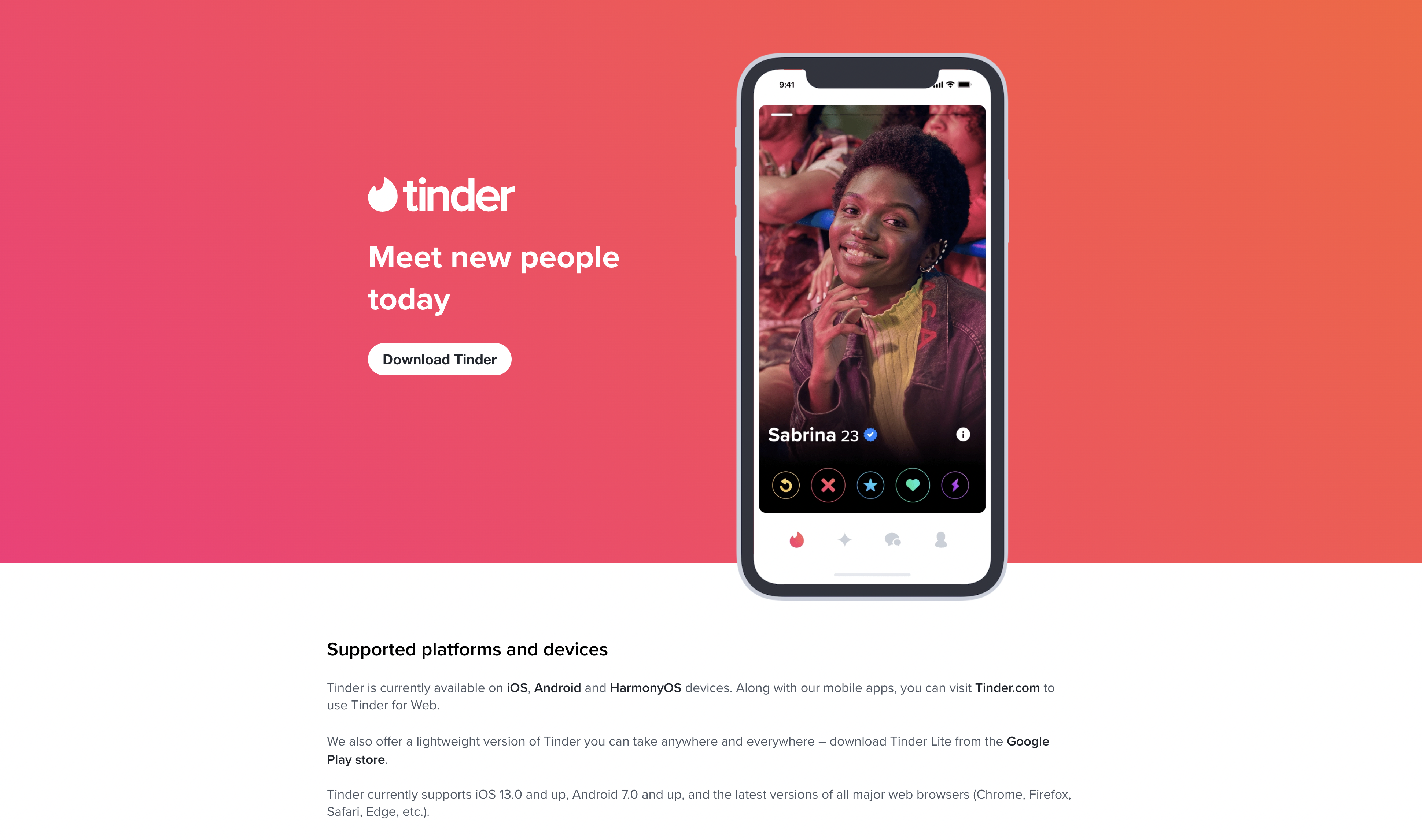
Tinder is a well-known app, so it doesn’t need to pack lots of information above the fold to encourage users to take action. Instead, it takes a minimalist approach with a 4-word headline, a CTA button, and an image of the app. That’s it! The rest of the page is dominated by Tinder’s bright and vibrant brand colour.
Another excellent feature is the use of the Tinder app as the hero image. It gives potential users a taste of the app experience by showing them exactly what it looks like in real-life.
The only negative is that the CTA button takes them to another page to download the app instead of directly to the app store. It creates an extra step - and therefore an extra chance for users to drop out.
But overall, a short landing page with a laser-focused goal and no distractions whatsoever - this is what a traditional landing page looks like.
2. Duolingo

Another well known app. This time, it’s for learning a language. Duolingo offers bite-sized lessons in 30+ languages and has over 500 million users.
What we love
The ‘rule of three’ is a copywriting technique that suggests a trio of words, characters or events is easier to remember. Duolingo uses this technique to great effect in their headline - free, fun and effective. This trio of words also outline the main three benefits of using Duolingo.
Duolingo doesn’t require lots of information or social proof above the fold because of its popularity and reputation. That’s why it can get away with a simple and minimalistic above-the-fold page design. However, keep scrolling and you’ll arrive at a benefit-led section that answers the all-important question…what’s in it for them?
While we’d like to see some images of the app interface so users can get a sense of the app experience, Duolingo’s brand is strong enough that it’s not required.
3. FaceApp

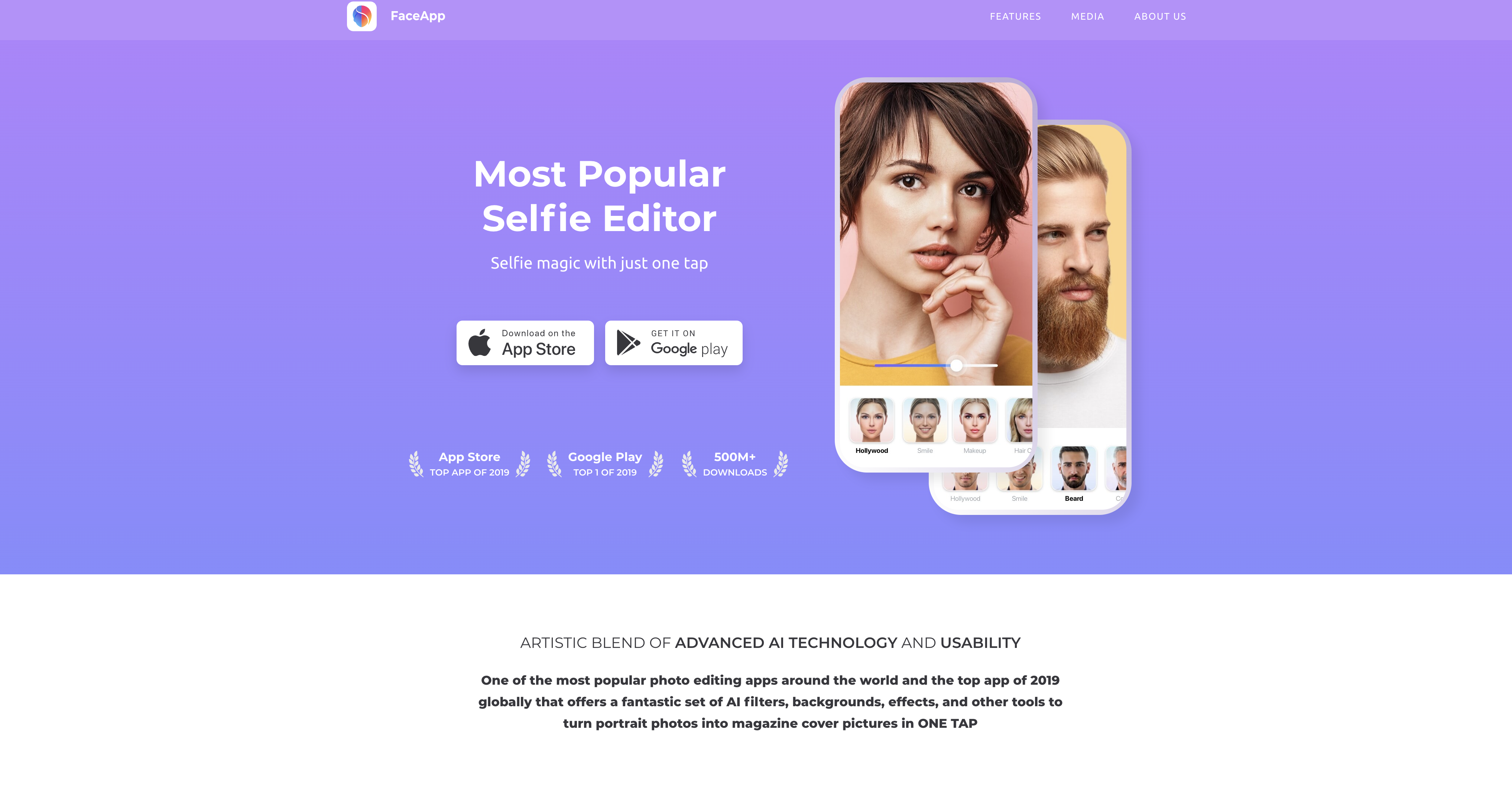
FaceApp is an AI photo editing app that lets you edit your selfies with AI filters, backgrounds and effects.
What we love
Show, don’t tell. That’s exactly what Faceapp does with a dedicated section of photos before and after the AI filters have been applied. It’s a powerful advantage for an app of this type where FaceApp can show users exactly what it does. They also have strong social proof with lots of mentions in some of the biggest publications in the world, including the BBC, Forbes, and Vogue.
4. Holy Owly

Holy Owly is an English app for kids that offers them a quick and easy way to learn English.
What we love
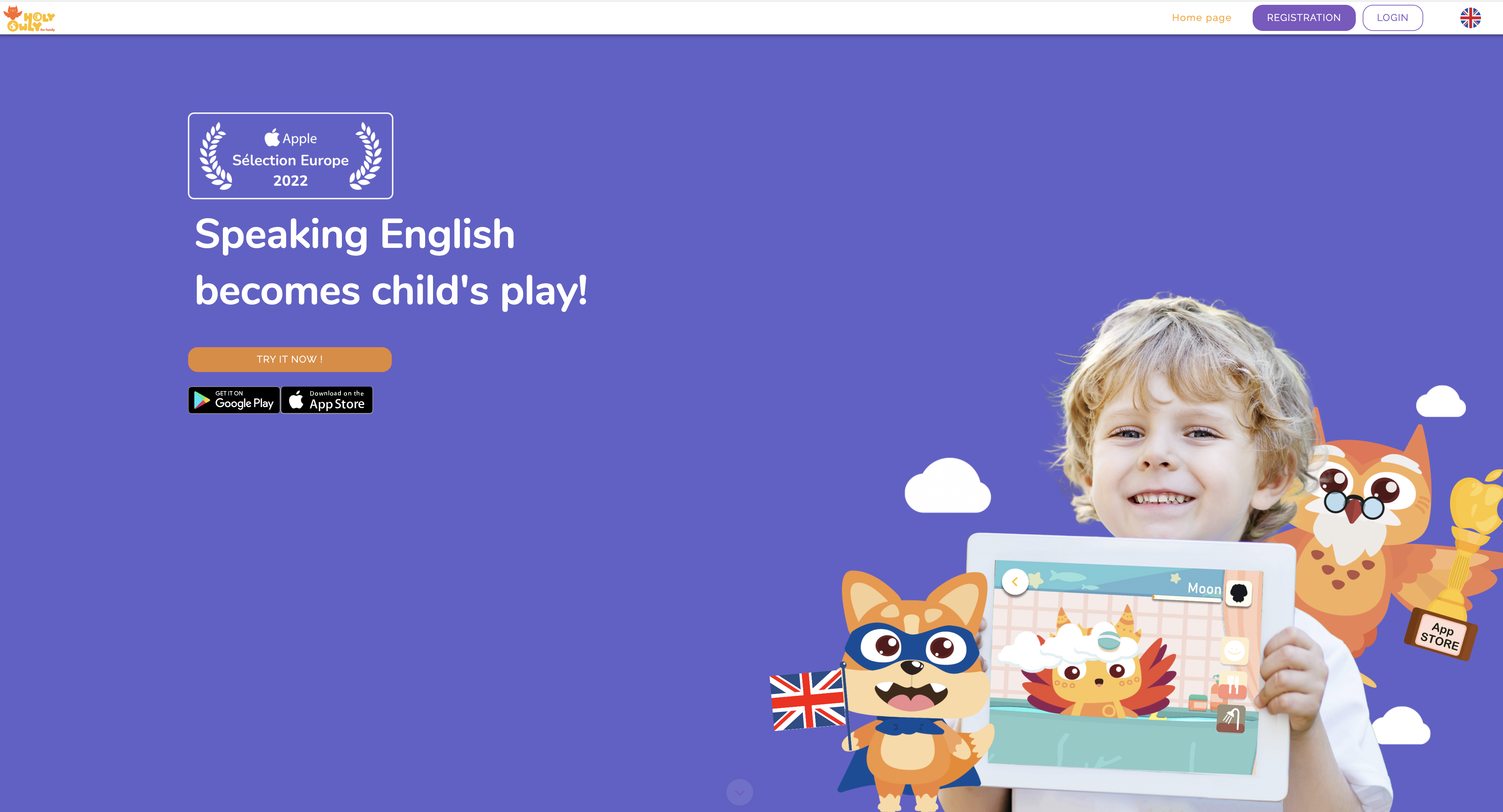
Holy Owly is a hybrid landing page in that it doesn’t have any menu navigation - meaning no distractions - but is long and requires the user to scroll to get more information. It does a great job above the fold with a minimalist approach, multiple paths to conversion (either app store CTAs or a ‘Try it now!’ link), and a photo of a smiling child using the app on a tablet surrounded by an animated fox and owl - two of the characters from the app. Using real photos has been shown to improve conversion rates, so this is a great idea.
Great stories need heroes and villains…and Holy Owly has lots of them! There’s Foxy, the English superhero, Katty Cat, the villain who has to be defeated at the end of each month, and Master Owly, the mentor who gives the child rewards for learning. This is a great page section that will appeal to kids and help make learning fun.
5. Mojo

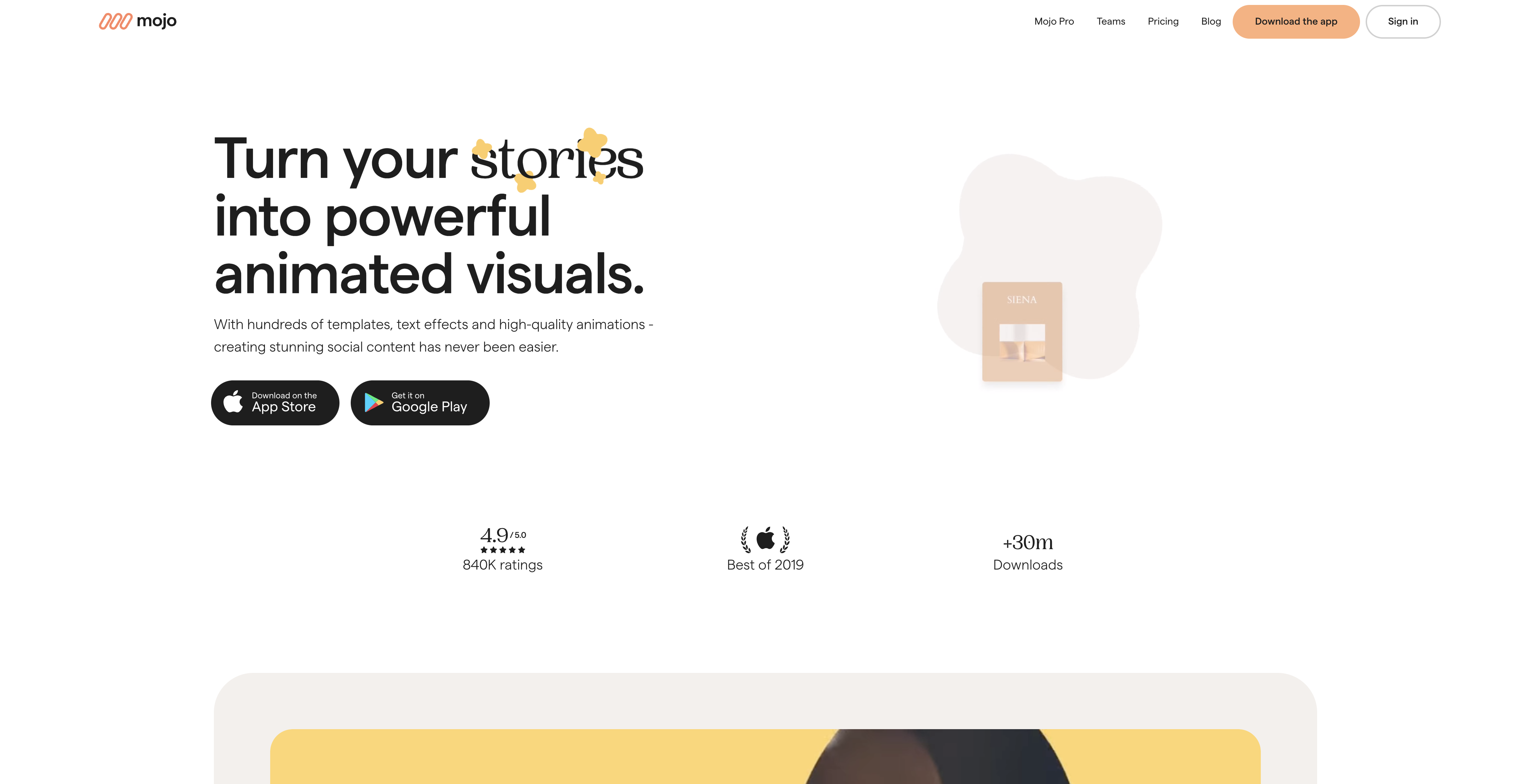
Mojo is a content creation app that lets users create eye-catching animated content for Instagram Stories and Reels.
What we love
This is a homepage rather than a landing page, but it effectively hooks users in with lots of page elements, including text, images, videos and icons.
It has a big, clear app store CTAs with ‘Download on the’ and ‘Get it on’ placed in front of the App Store and Google Play text to generate more clicks. Plus there’s lots of powerful social proof above the fold highlighting the fact the app has been downloaded more than 30 million times.
Please listen the CEO of Mojo, Jean Patry, interviewed in Purchasely”s podcast, Subscription League: Strategies you should focus on for a successful subscription business with Jean Patry (Mojo)
6. Moonoa

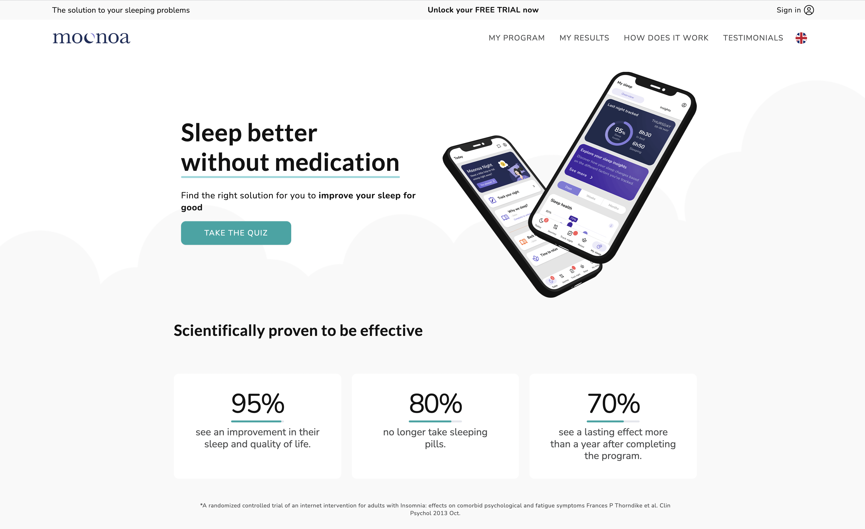
Moonoa is an app that uses a sleep tracker and cognitive behavioural therapy (CBT) to help you understand your sleep patterns so you can change your sleep habits for the better.
What we love
Moonaoa’s page is more of a homepage than a traditional landing page, with multiple navigation options in the header and footer. You have to scroll in order to get all the information. In Moonoa’s case, this isn’t a bad thing. They lead with a compelling, customer-focused headline that speaks directly to a major objection that many people have when it comes to poor sleep - they don’t want to take medication!
They have lots of powerful social proof in the form of “scientifically proven” data based on a randomized controlled trial, plus lots of reviews from their community. The key features are easily scannable in a bite-sized icon format.
7. Nara Baby Tracker

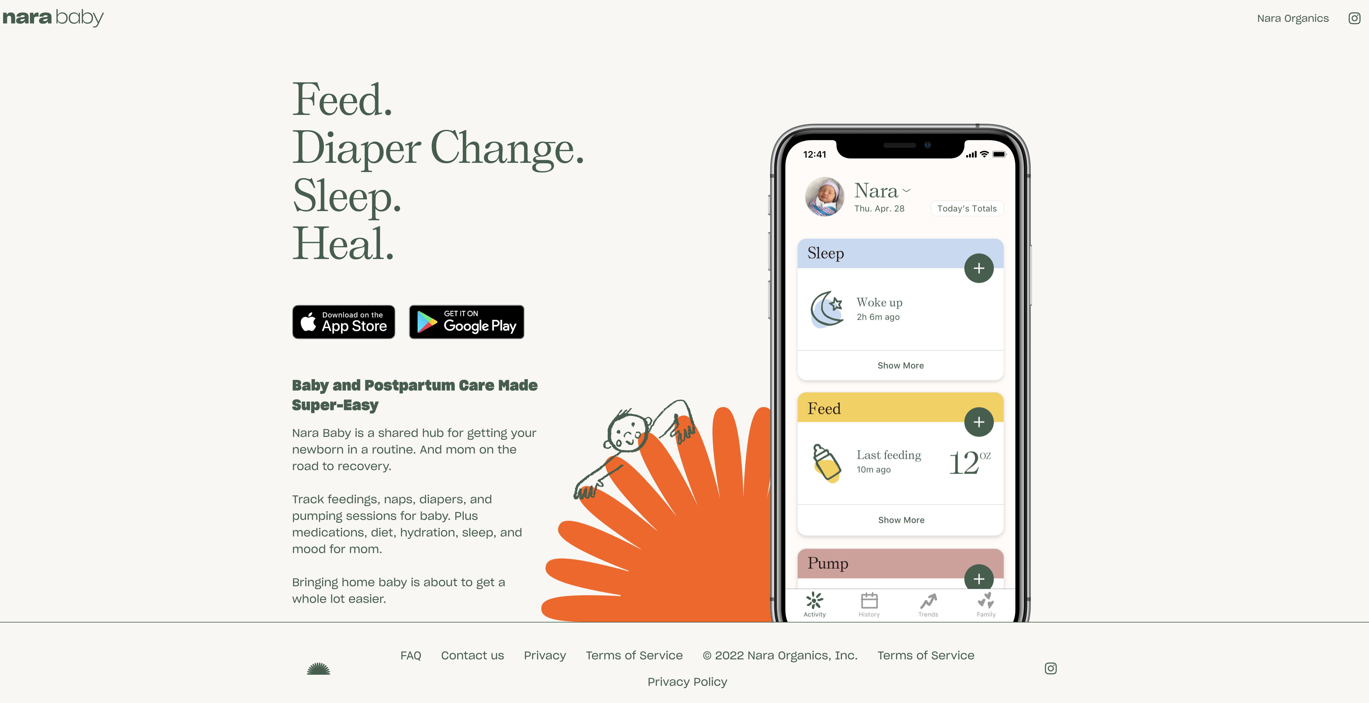
Nara Baby Tracker is an app for mom and baby that gives you all the data you need to get your baby into a good routine and mom on the road to recovery.
What we love
Every great app landing page needs to do one thing well: be clear on what the app does and who it’s for. Nara does a great job of this by making it clear within seconds that it's not just for the baby, but for the mom too. The copy is not only clear but outlines the benefits of using the app for both mother and baby, with clear CTAs that take users to the app store to download.
Like many of the strongest app landing pages we’ve included, Nara includes a big, clear image of the app interface with an injection of colour and a small illustration next to the image to add a bit of personality to the page. The only downside is the inclusion of lots of links in the footer - distractions that will likely reduce conversion rates.
8. Reflectly

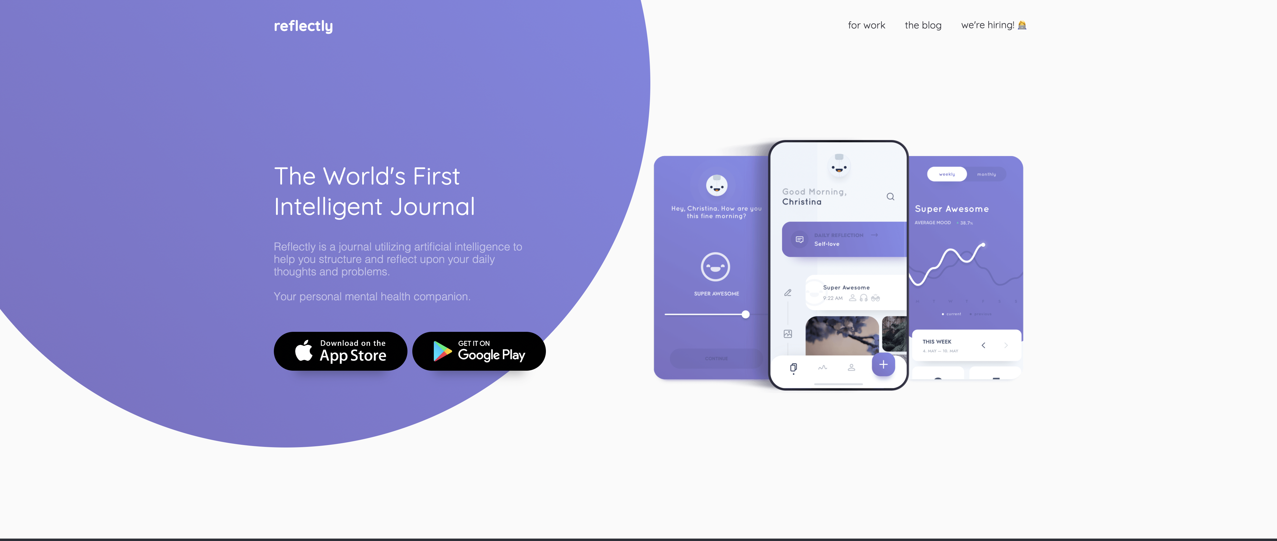
Reflectly is a journaling app that uses AI to help you structure and reflect upon your daily thoughts and problems, offering personalized motivation and prompts.
What we love
Reflectly has a short, simple and focused landing page with two big clear CTAs that take the user directly to the app stores to download. It also has several images of the app interface so you users can see exactly what their experience will be like.
Reflectly checks a lot of the boxes when it comes to its above the fold section: captivating headline, subheadline, a hero image of the app which adds context, and two CTAs. Like Mojo, Reflectly adds an actual call-to-action on each of the app store buttons (“Download on the App Store” and “Get it on Google Play”).
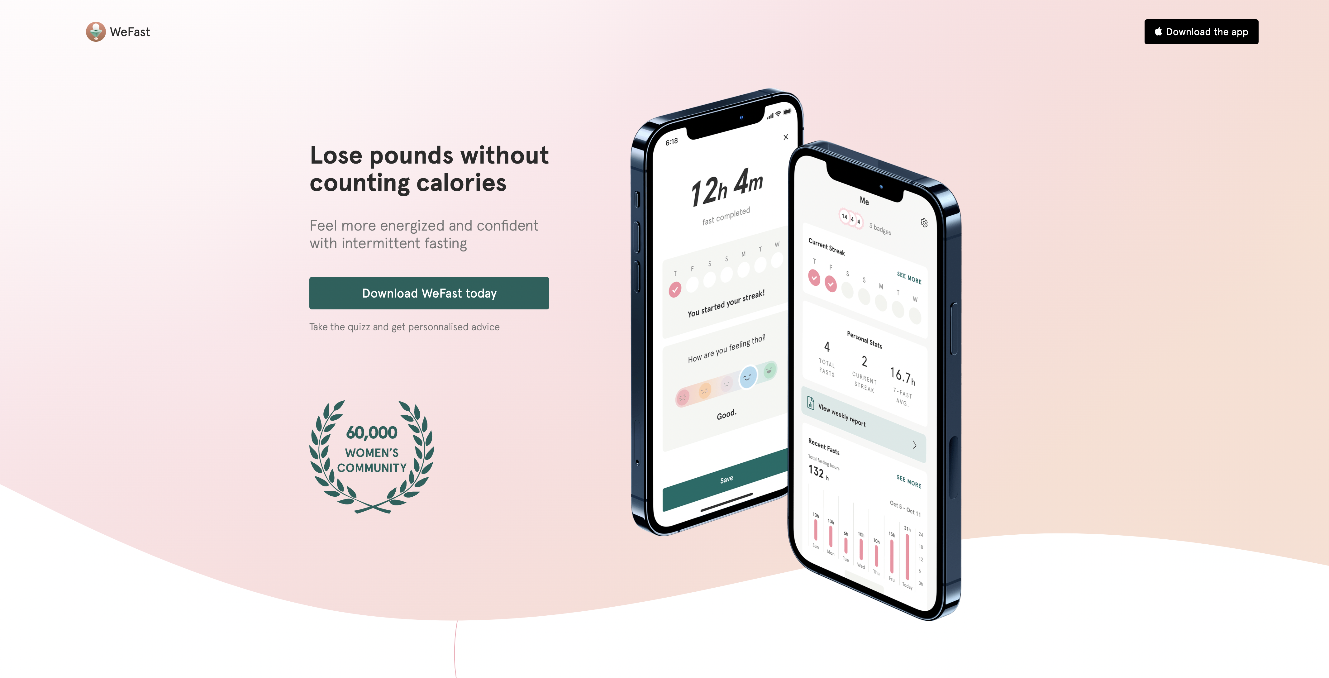
9. WeFast

WeFast is an intermittent fasting app tailored specifically for women. It gives women recipes, motivation, and expert advice so they can get healthier - all in one place.
What we love
WeFast is another longer landing page that has a strong above-the-fold section with a benefit-focused headline and subheadline, clear visuals of the app interface, and social proof demonstrating the size of their community. Their CTAs are clear and direct and take them directly to the app store. No messing around.
Below the fold, WeFast makes excellent use of user-generated content (USG) by including messages from women who have been using the app to successfully lose weight with before and after photos. UGC has a positive impact on conversions, up 8.5% according to the latest research.
How to build an app landing page that converts
Now you’ve got a feel for what does and doesn’t work when creating a landing page, let’s summarize some of the key features that you’ll need to include in order to create a landing page that gets as many downloads of your app as possible.
- Establish your conversion goal. For an app landing page, the most common goal will be to download the app. The most effective way of doing this is by creating big, visible CTA buttons that take users directly to the Android and iOS app stores. However if your homepage will serve as your landing page, then your goals will be different and less direct.
- Make your design mobile-first. Apps are designed for phones. And most people will be viewing your landing page on their phones. So it should go without saying…make sure your landing page design is mobile friendly!
- Cover the essentials. Don’t bog users down in more information than they need. Remember, your goal is to get them to the app store, which will contain even more information on the app. So pique their interest, build curiosity, but don’t overwhelm.
- Show the app. The majority of the examples shown above had images of the app interface, sometimes by themselves, other times benign used by people. There’s a reason for this: it works. If your goal is to get people to download the app, showing them what they can expect will increase the likelihood of them taking that extra step towards the app store to find out more.
- Speed matters! A slow loading experience will decrease your conversions. Period. People want fast (we’re talking 1 second max) loading times. Use the AMP-framework to create faster-loading pages.
Key takeaways
- Landing pages are standalone web pages that are designed with specific, singular goals in mind.
- Landing pages have been proven to increase conversions and should be an essential piece of your mobile app marketing strategy.
- Some app developers use their homepage as their landing page. However, the function of a homepage is quite different, with navigation and multiple CTAs providing a different user experience.
- A high-converting landing page must have a strong headline (and possibly subheadline), high-quality visual images, lots of social proof, and strong CTAs.
- When building a landing page, make sure the goal has been established first, design it from a mobile-first mindset, keep the content lean, and make sure the page loads quickly.
Power Up Your App Design Strategies with Purchasely
App landing pages are great marketing assets to optimize acquisition of downloads. A great design of in-app paywalls is a key pillar of any subscription strategy.
Read our eBook Top 10 Paywall Design Tips to get practical recommendations with matching examples to design paywalls that convert user into susbcribers.
Book a 30-minute product tour with one of our experts where they’ll talk you through the intuitive Paywall Builder provided by Purchasely.

.png)
